Thursday, September 26, 2013
Avoiding mergers
I picked this photo for avoiding mergers because the smoke is in a weird spot and none of their feet are showing.
Framing
I picked this photo for framing because the opening in the wall looks exactly like a frame showing the smoke and burning building.
Balance
I picked this photo for balance because there's a reflection of the fireman. And it looks like there is a split in the photo between the president and the fireman.
Lines
I picked this photo for lines because the repetitive lines draw's the viewers' attention to thier center of interest.
Rules of Thirds
I picked this picture for rules of third because it is indicating the placement which also gives the model a definite path to follow within the picture area.
POST SHOT REFLECTION
Tuesday, September 24, 2013
Repetition Photos
Elements Of Art & principles of design
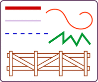
Line: are marks made by a pointed tool; brush,pencil,pen,etc.
Shape: are formed wherever the ends of a continuous line meet.
Color: color wheels show the primary colors, secondary colors, and the intermediate colors.
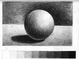
Value (tone): refers to dark light; value contrast help us to see and understand a two-dimensional work of art.
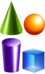
Form: describes objects that are three-dimensional, having length, width, & height.
Texture: the surface quality, both simulated and actual of ark work.
Space: distance or areas around,between, or within components of a piece.
Balance: is the comfortable or pleasing arrangement of things in art. There are three different types of balance: symmetrical, asymmetrical, and radial.
Contrast: is created by using elements that conflict with one another. Often, contrast is created using complementary colors or extremely light and dark values. Contrast creates interest in a piece and often draws the eye to certain areas. It is used to make a painting look interesting.
emphasis: in the focal area of an artwork gives it importance.An artist may stress some elements of the design over others. The eye of the viewer will focus on the area of emphasis or center of interest first, then take in the rest of the composition.
Movement: in an artwork means the artist is taking viewers on a trip through the work by means of lines, edges, shapes, and colors often leading to the focal area. Movement is a visual flow through the composition.
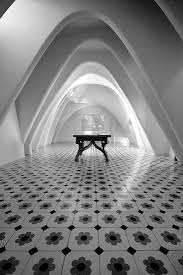
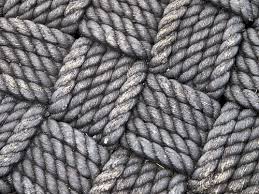
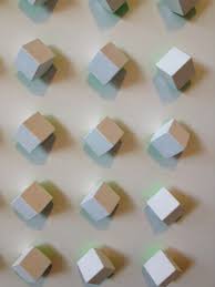
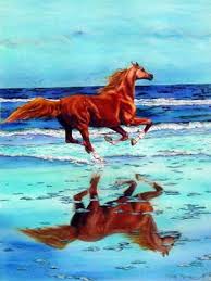
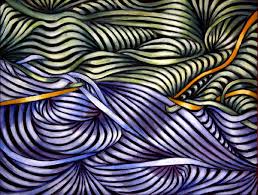
Pattern: are made in art when the same shapes or elements are repeated again and again. Pattern uses the elements of art in planned or random repetitions to enhance surfaces of paintings or sculptures.
Rhythm: is the repetition of shapes, lines, and forms. Rhythm is a movement in which some elements recurs regularly. Like a dance, it will have a flow of objects that will seem to be like the beat of music.
Unity: means that all elements in an artwork are in harmony. Unity brings together a composition with similar units. For example, if your composition was using wavy lines and organic shapes you would stay with those types of lines and not put in even one geometric shape.
Friday, September 20, 2013
Monster Meal
My Monster Meal would be a 5 pound steak with loaded mash potatoes and a huge Cesar salad on the side, and a brownie with ice cream on top as the desert. And you can only get this at a steak house.
National Geographic Warm-up
This is my favorite picture because i love pictures that are taken under water. I also picked this picture because sea lions are one of three underwater animals i love. This picture shows a lot of detail, it has great lighting, and is a very good angle.
A picture that i would submit in a photo contest is maybe a picture of wild horses running in a great plain in the mountains, because i have a ranch out in Buda TX, and i love to see horses run.
Wednesday, September 18, 2013
40 Greatest Photos Ever
I picked this photo was because when i graduate from high school i want to go into the military and this made me think, that once you leave your family you will be missed.
I think that this photo made the top 40 was because this shows a lot of emotion and is very sentimental.
I picked this photo because this made me feel bad for this little boy when his dad died because he volunteered to go to Iraq for a few weeks and than come back home. And at his funeral Christian was able to accept the flag for his father.
I believe this mad the top 40 because this was a very honorable thing to do for his father. and this picture shows a lot of detail, with the soldiers in the background, the flag being handed to him, and the little boy trying to stay strong for his father.
I picked this photo because this shows John F. Kennedy Jr. (John John) saluting his fathers coffin with all of the honor guard. this was a very remember-able moment in history. john F. Kennedy was one of the greatest president in the history (in my opinion).
I think this photo was i the top 40 because this was a very hard time in America and it will always be remember.
Sunday, September 15, 2013
Great Black and White Photography, Part II
This photograph is by Ansel Adams. Ansel was born in Western Addition of San Francisco, California on February 20, 1902 and died on April 22, 1984. His pasion was piano so his father got him a piano teacher named Maria Butler. After studying four years under her guidance he move on to different teachers. After this piano was his intended profession. He then Latered to study on Photography. And ever since then it has been his profession to take photos. One of his Famous Woks was the Tetons and the Snake River.
Camera Parts
Aperture: is an opening, hole, or gap.
Shutter: is a device that opens and closes to expose the film in a camera.
Depth of field: is the distance between the nearest and the furthest objects that give an image to be focused in a camera
F-stop: The f/stop regulates how much light is allowed through the lens by varying the area of the hole the light comes through.
Focus length: the distance between the center of a lens or curved mirror and its focus
Camera history
1) The camera obscura is a "dark room" where a small hole is created so that light from the outside to go through inside. it was achieved by through that little hole that was created it was made to be like a lens projecting the light on to the wall of the dark room
2) In the 17th century Isaac Newton and Christian Huygens prefected on the understanding of optics and the quality of high glass lens.
3) Joseph Nicephore Niepce added film to create the first successful photograph by using a glass lens, a dark box and film
4) Digital cameras and Niepce camera has three thing in common and that is film, lens and a dark box.
5) To capture a photo on a digital camera is a built-in computer
6) The difference between Auto mode and program mode is on auto mode the camera will completly control flash and exsposer while program mode you control flash and other camera settings
7) Portrait mode is used for capturing the object and not the background and it works by bluring out the backgrand and using the fastes avalible lens.
8) Sports mode is used for to capture a fast moving object and it works by freezing motion and using the fastest shutter speed possible.
9) The half press will tell the camera that you are almost ready to take the photo and it will trigger focus lock and faster full press response.
10) That symbol mean Auto-Flash , auto-flash will automatically fire if the camera thinks it needs more lighting.
11) The other symbol means Disabled Flash, disabled flash is when there is no flash at all and at times the mood will be more dramatic in natural lighting.
12) If there is too much light the picture will be washed out.
13) If there is not enough light the picture will be too dark to even see.
14) The trem "stop" is the measurment of light.
15) If there was two suns it would be one stop brighter.
16) If there was four suns it would be two stops brighter.
17) The affect of a longer shutter speed = more light
18) The affect of a shorter shutter speed = less light
19) The aperture controls light before reaching the film. It acts like a pupil.
20) To increas the amount of light on the aperture you use a larger opening.
aac newton
C
Thursday, September 12, 2013
Happy,Metal, Red
Happy: Tommy is happy because it was his senoir picture and he was in a good mood
Metal: this is a great picture because it has a good angle, good lighting and it is presenting what the students in STEM academy has made.
Red: this is a good photo beacuse it has a great angle and great lighting. and it is also showing us what the hallways of Akins High School looks light.
Metal: this is a great picture because it has a good angle, good lighting and it is presenting what the students in STEM academy has made.
Red: this is a good photo beacuse it has a great angle and great lighting. and it is also showing us what the hallways of Akins High School looks light.
Tuesday, September 10, 2013
Friday, September 6, 2013
best and worse photo
i like this picture because we all look very happy. and it was of school and after this day we became friends
Subscribe to:
Comments (Atom)


